Aperture: A Brand Identity From Scratch
A full visual identity (logo, type, color, and usage rules) built to hold up everywhere from a favicon to a marketing site.
- Client
- Aperture
- Role
- Lead Designer
- Year
- 2025
- Duration
- 6 weeks
A startup with a name, an idea, and nothing to look at. I built the identity from nothing: a flexible logo, a type system, a color palette, and a guidelines doc the whole team could design against without asking me first.
Results
- 40+
- Brand assets delivered
- 12
- Logo concepts explored
- 28
- Guideline pages
Concept project. Aperture isn't a real client, and these numbers are the targets I designed against, not results from a shipped product.
The brief
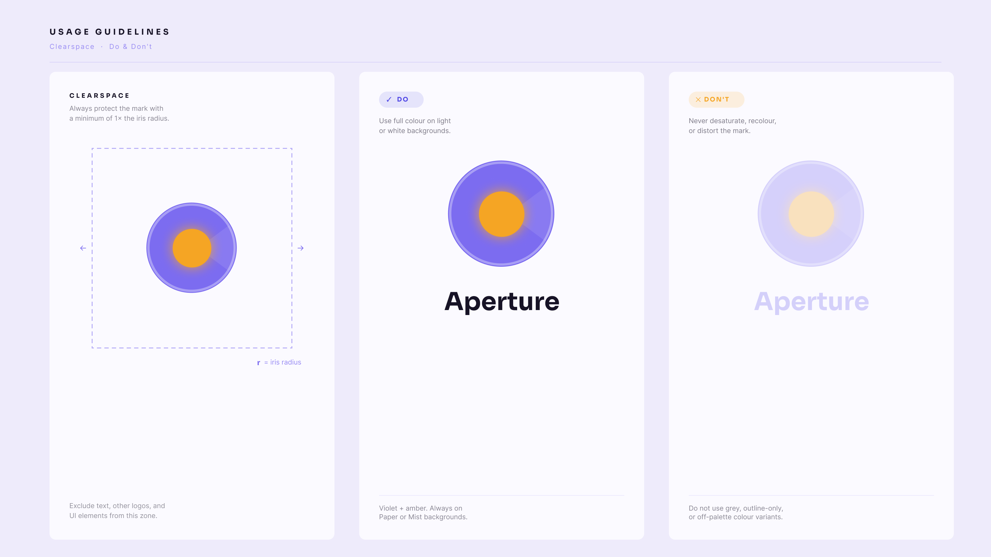
They wanted something modern and trustworthy that didn't look like every other startup. It also had to survive a 16px favicon, a billboard, a dark-mode app, and a printed deck, so how far it stretched mattered as much as how it looked.
Exploration
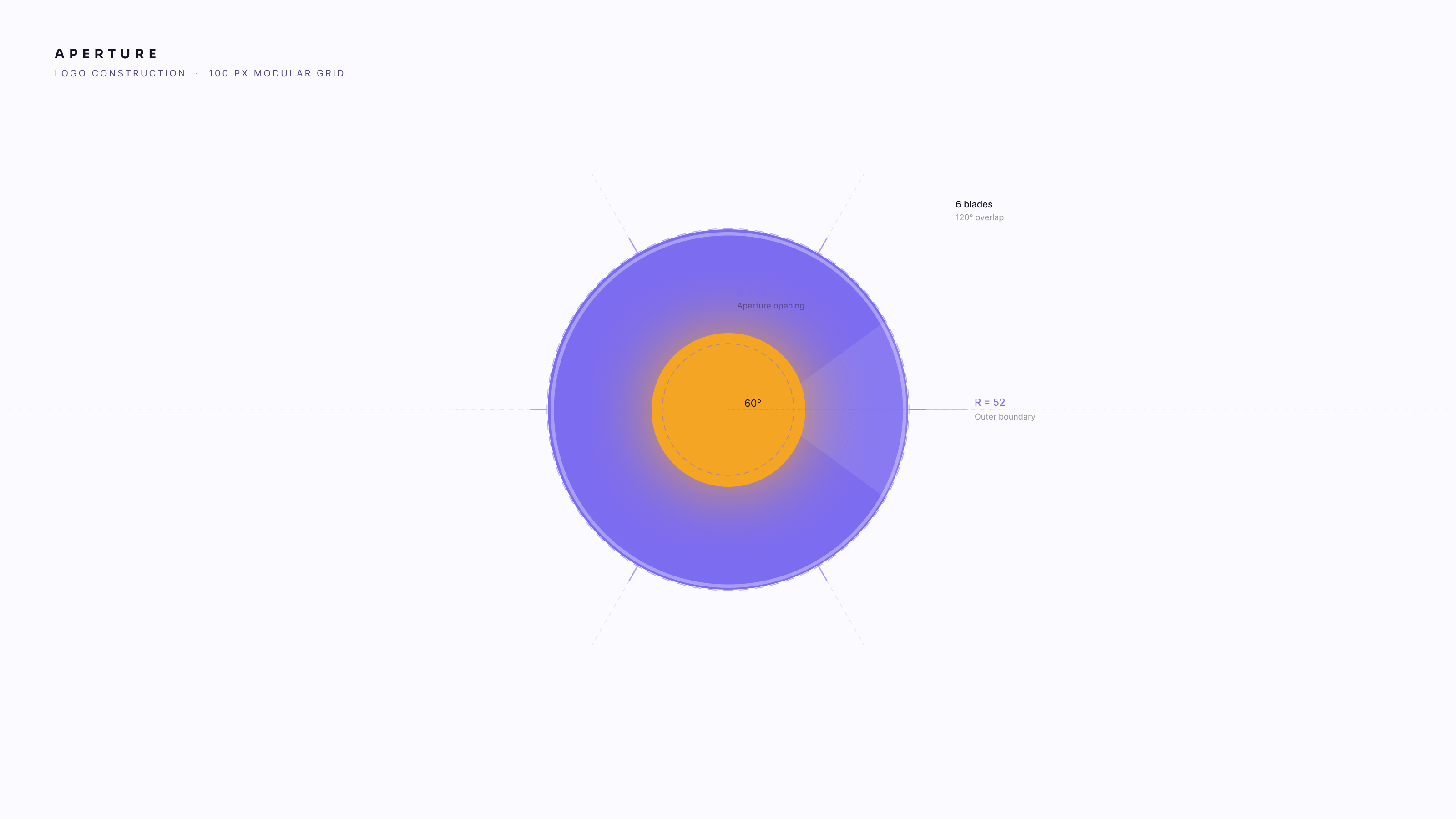
Mood boards, then dozens of sketches, down to three directions, then one. I tested every mark small and in monochrome early, because that's where a logo usually falls apart and it's cheaper to find out in week one.
The system
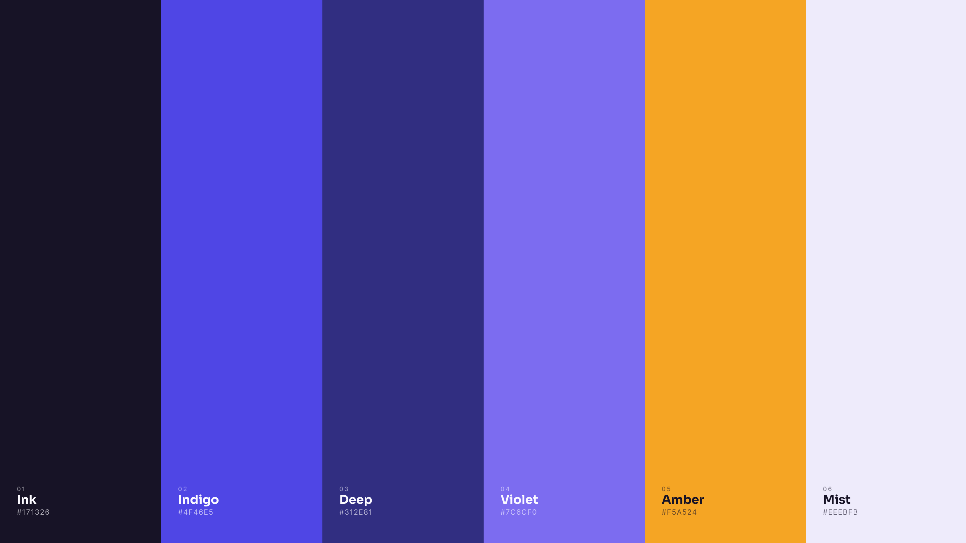
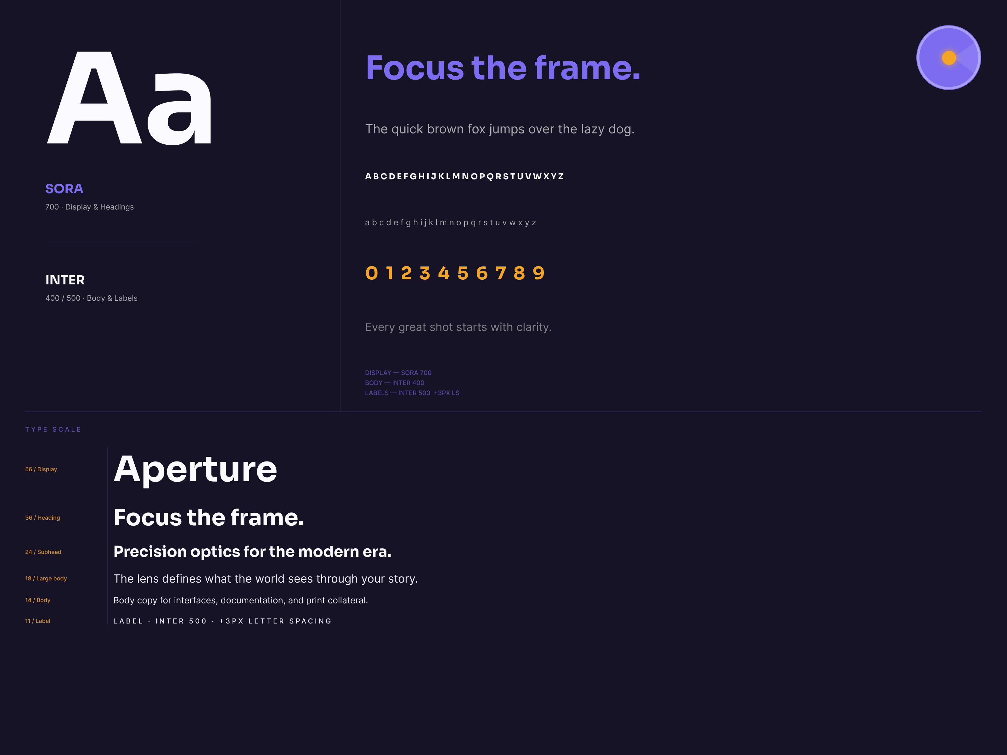
Past the logo: a type scale, a primary and extended palette with contrast that passes, iconography rules, and layout principles. All of it packaged into a guidelines document written to be used by people who aren't designers.
Outcome
The identity runs across the product, the marketing site, and social. The part I care about: with the system written down, the team ships on-brand work without a designer signing off on every asset.