Lumin: Online Learning Platform UI
An interface for an online course, designed around one goal: keep students moving through lessons instead of quitting halfway.
- Client
- Lumin (online learning)
- Role
- UX/UI Designer
- Year
- 2024
- Duration
- 4 months
Students quit online courses when they lose the thread. This was a rework of a course experience so you always know where you are, what's next, and how much is left, and so the interface isn't competing with the lesson for your attention.
Results
- +29%
- Lesson completion
- −40%
- Navigation steps
- 84 SUS
- Usability score
Concept project. Lumin isn't a real client, and these numbers are the targets I designed against, not results from a shipped product.
The problem
Students were dropping off mid-course. The old layout hid progress, tangled navigation into the content, and made it easy to lose your place after a break. No single one of those is a big deal. Together they're enough to make someone not come back tomorrow.
Design goals
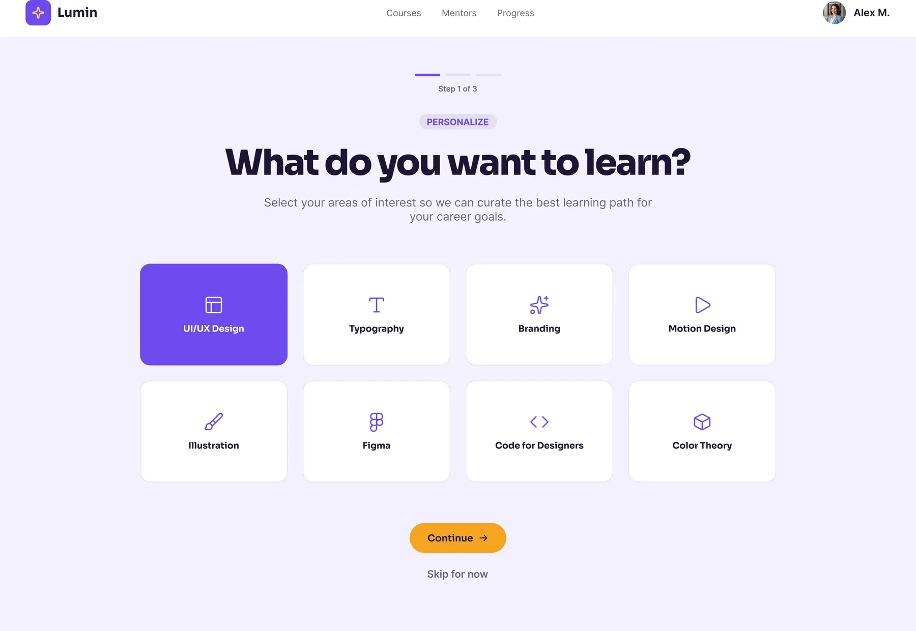
Make the next action obvious on every screen, put progress somewhere you can't miss it, and quiet everything around the lesson. When I wasn't sure about a decision I asked whether it helped someone keep going, and cut it if it didn't.
The solution
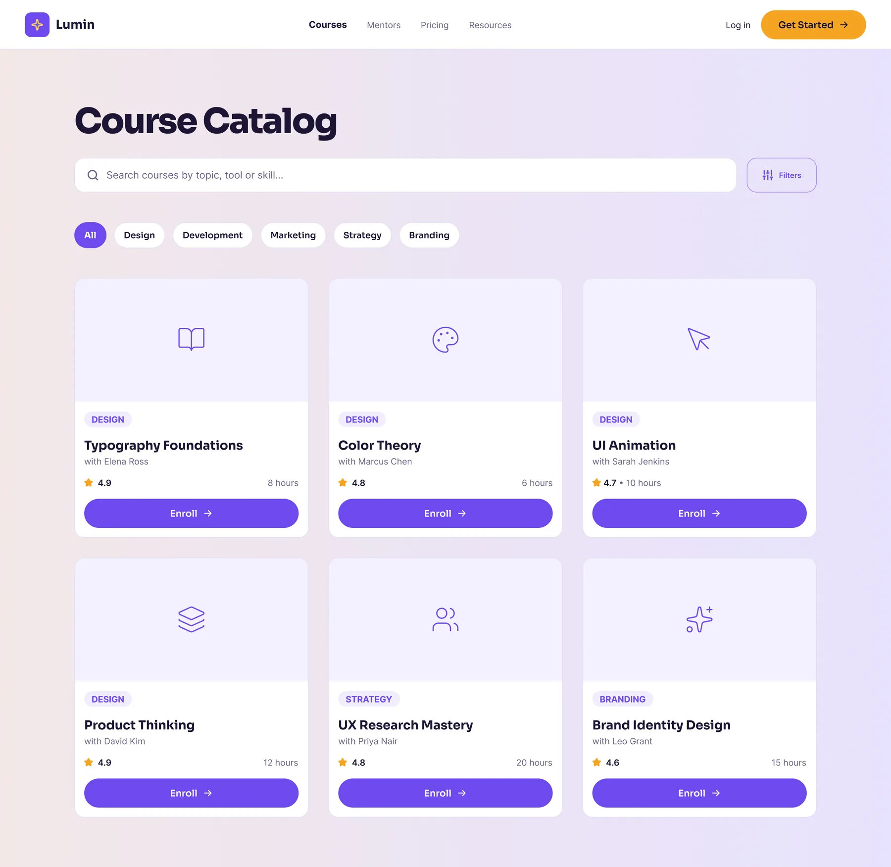
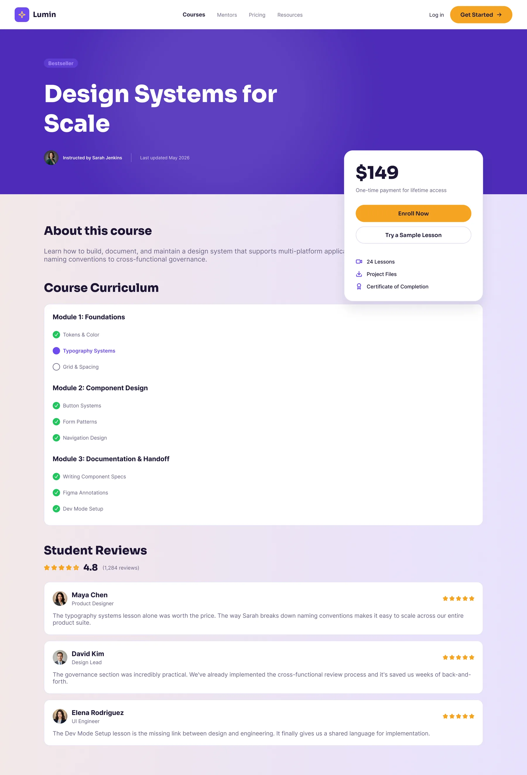
A quiet lesson view with a progress rail that's always there, a course map you can actually read, and the same patterns for video, reading, and assessment so nothing needs relearning. Plus a clear bit of feedback every time you finish a step, because finishing things is the whole motivation.
Outcome
The targets were lesson completion up 29% and a shorter path through each course. What I'd actually want to know is whether someone can sit down after a week away and pick up where they left off without hunting for it.